If you think the content of your newsletter is the only thing that matters, I’ve got some tough love for you: the best writing in the world won’t save a messy, cluttered, or confusing layout. In 2026, our attention spans are shorter than ever. We’re reading emails on tiny screens while standing in line for coffee or sitting on a train. If your newsletter feels like ‘work’ to consume, your readers will simply stop consuming it.
I’ve spent hundreds of hours A/B testing different layouts, looking at heatmaps, and analyzing click rates for my project at Digital Success Lane. What I’ve discovered is that there is a very specific way to structure a weekly email newsletter for maximum engagement. It’s not about being ‘fancy’ or using ‘flashy’ graphics. In fact, it’s often the opposite. It’s about clarity, flow, and extreme mobile optimization. Here is my personal blueprint for the perfect weekly newsletter structure.
The Mobile-First Mandate
First, let’s talk about the elephant in the room: mobile. Depending on your niche, anywhere from 60% to 80% of your opens are likely happening on a smartphone. This means that if your newsletter has a two-column layout or tiny text, you are effectively pushing your readers away.
I always use a single-column layout. Always. It’s the only way to ensure that your text, images, and buttons stack predictably on every device. It prevents that annoying horizontal scrolling and keeps the reader moving in one direction: down.
Your font size also matters. I see so many newsletters using 12px or 14px text. That’s too small for a mobile screen. I use a minimum of 16px for my body text, with a generous 1.6 header-to-body line height. You want your readers to be able to scan your content comfortably without squinting. If they have to zoom in, you’ve lost the battle for engagement. Industry giants like Mailchimp have long advocated for this minimalist, mobile-first approach as the standard for high-converting emails. This isn’t just a design choice; it’s an accessibility requirement in a mobile-driven economy.
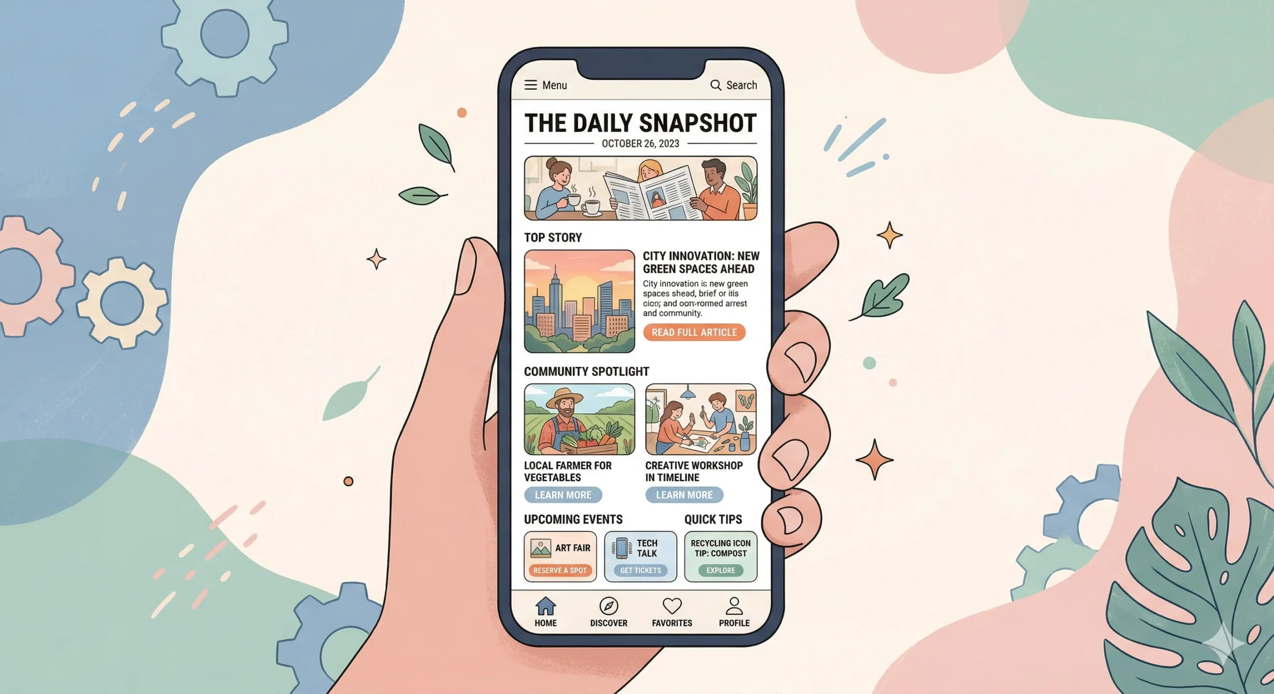
The Modular Architecture
I think of my newsletter structure as a series of modules. Each module has a specific job to do. By keeping it modular, I can easily swap content in and out while maintaining a consistent ‘look and feel’ that my readers recognize. Here is the order I recommend:
1. The Hook (The Introduction)
This is the most important 50 words in your entire email. Don’t waste it with ‘Hi everyone, hope you had a great week.’ That’s fluff. Start with a story, a shocking stat, or a direct question. You need to earn the reader’s permission to keep scrolling. I like to write this in a very personal, friendly voice – similar to how I’d write to a colleague. This builds immediate rapport and sets the tone for the rest of the issue. The hook is where you prove that you understand their world.
2. The Hero (The Main Event)
This is where your primary value lives. If you have a new blog post, a deep-dive analysis, or a major industry update, it goes here. I usually follow a ‘Headline + Teaser + Button’ format. The button (CTA) should be high-contrast and large enough (at least 44×44 pixels) to be easily tapped with a thumb. I’ve found that placing one clear, primary CTA here – rather than ten small links – drastically increases the total click count. It keeps the reader’s journey simple and focused.
3. The Curation (The Value-Add)
After the main event, I include 3-5 ‘curated’ links. These aren’t just random articles; they are high-value resources that I’ve hand-picked for my audience. The key here is to add your own commentary. Why does this link matter? What is the one thing the reader should take away from it? This confirms your status as an expert and a helpful filter. This is a great place to link to other relevant posts you’ve written, like a guide on Best Newsletter Growth Strategies for B2B Startups. Curation is about saving your readers time in an era of information overload.
4. The Interactive (The Engagement Booster)
Engagement isn’t just about clicks; it’s about interaction. I love including a simple poll at the end of every issue. ‘What was the most helpful part of this email?’ or ‘What topic should I cover next week?’ These polls consistently get the highest click rates in my entire newsletter. They make the reader feel involved in the ‘Digital Success Lane’ community and provide me with invaluable data. When people feel heard, they stay longer.
Scannability: The 3-Second Rule
Most people ‘scan’ before they ‘read.’ If they can’t understand the main points of your newsletter in three seconds of scrolling, they probably won’t stay for the full three minutes of reading. This is a psychological barrier that I take very seriously.
To optimize for scannability, I use:
- Short Paragraphs: Never more than 2-3 sentences. Large ‘walls of text’ are the number one killer of mobile engagement. They feel like a chore to decipher.
- Frequent Headers: Give the reader ‘road signs’ so they know what’s coming next. Headers break up the visual weight of the page.
- Bold Text: Highlight the most important sentence in each section. This allows the scanner to get the gist of your argument without reading every word.
- Bullet Points: Use them whenever you’re listing more than two things. They are much easier for the brain to process than a comma-separated list.
If you look at the structure of a successful brand like Constant Contact, you’ll notice they rely heavily on these visual cues to guide the reader’s eye through the ‘path of least resistance.’
The Visual Balance (The 7:3 Rule)
I love a good image, but I hate a slow-loading email. In 2026, deliverability is tied to the ‘weight’ of your email. If your newsletter is full of massive, high-res photos, it might end up in the ‘Promotions’ tab – or worse, the spam folder.
I follow a ’70:30′ rule: 70% text and 30% images. I use images to support the content, not to *be* the content. Every image should have descriptive Alt Text so that if the images don’t load (which happens often on corporate email servers), the reader still knows what they’re missing. This is also vital for visually impaired readers who use screen readers.
Also, consider Dark Mode. Many mobile users have their phones set to dark mode by default. This means your white background will turn black. If you have a logo or graphic with a ‘white box’ around it, it will look terrible. Use transparent PNGs for your logos and ensure your text colors have enough contrast to be readable in both light and dark settings. Testing for dark mode is no longer optional; it’s a standard part of a professional workflow.
The Singular Goal: Fighting Choice Paralysis
One mistake I see all the time is the ‘everything but the kitchen sink’ newsletter. It has five different articles, ten social media links, three affiliate offers, and a request for a testimonial. It’s overwhelming for the reader and confusing for the marketer.
When you give people too many choices, they often choose… nothing. It’s called choice paralysis. I’ve seen engagement drop by as much as 40% when I’ve tried to cram too many distinct messages into a single issue.
Every edition of my newsletter has one singular ‘primary goal.’ Maybe it’s to get clicks on a new article about How to Increase Newsletter Subscriber Retention Rates. Maybe it’s to get people to sign up for a webinar. Whatever it is, that goal gets the most visual weight and the clearest CTA. Everything else is secondary. By focusing the reader’s attention on one specific action, I’m able to drive much more significant results. It’s about building momentum, not presenting a buffet.
Advanced Personalization Within the Structure
Beyond just the layout, how you ‘fill’ these modules for different segments of your audience matters. In 2026, I use dynamic content blocks that change based on a subscriber’s behavior. If someone is a regular clicker of my ‘B2B Growth’ section, their ‘Hero’ module might be different from someone who only opens my ‘Personal SEO’ tips. This doesn’t require a different structure; it just requires a smarter use of the existing modules. This level of sophistication is what separates a world-class newsletter from a hobbyist’s project.
The Footer: Don’t Just Say Goodbye
Most people ignore the footer, but it’s actually a prime piece of digital real estate. It’s where your most loyal readers – the ones who scrolled all the way to the bottom – end up. It’s the ‘last word’ of your weekly conversation.
I use my footer for three things:
1. Trust-Building: I include my physical address (required by law) and a short ‘Why you’re getting this’ reminder. This reduces spam complaints significantly.
2. Preference Management: I make it incredibly easy for people to update their preferences or unsubscribe. As we’ve discussed before, I’d rather have a smaller, more engaged list than a massive list of people who don’t want to be there. A healthy list is a profitable list.
3. The ‘P.S.’: This is an old direct-mail trick that still works wonders in 2026. The P.S. is often the most-read part of the entire letter because it stands out from the main body blocks. I use it to share a tiny personal update, a book recommendation, or a ‘teaser’ for next week’s issue. It adds that final human touch that keeps people coming back for years.
Refine, Don’t Set and Forget
The structure I’ve outlined here isn’t a ‘set it and forget it’ solution. It’s a starting point. I look at my analytics every week. If I notice that no one is clicking the ‘Curated’ section, I might move it higher up or change the formatting. If people are loving the ‘Interactive’ polls, I might make them more prominent and move them into the hero section occasionally.
The ‘perfect’ structure for your audience is something you’ll discover over time by listening to their behavior. Stay curious, keep testing, and always prioritize the reader’s experience over your own design ego. A newsletter is a conversation, and the structure is simply the room where that conversation happens. Make it a room where people want to stay, feel comfortable, and leave feeling smarter than when they entered.
I’m constantly looking at new ways to optimize the ‘Digital Success Lane’ experience, and I’m always happy to share what I find. These technical details might seem small, but they aggregate into a massive difference in your long-term ROI. If you’re just starting your journey, focus on the basics: single column, big text, and a human voice. You can’t go wrong with those foundations. See you in the inbox next week – I’ll be the one with the big buttons and the short paragraphs ready to help you grow.
Leave a Reply