I once spent over three intense hours debating with a development team about where exactly to put a single, high-quality customer review on a premium client’s main product page. It sounded like complete overkill and a waste of billable hours at the time, but that one specific decision – moving the detailed review with a photo from the very bottom of the long page to right next to the high-contrast ‘Add to Cart’ button – increased their immediate conversion rate by a measurable 12%.
Small, intentional changes in User-Generated Content (UGC) placement lead to surprisingly massive changes in overall ROI. In the ultra-competitive e-commerce environment of 2026, your product page isn’t just about your professional photos and your polished marketing copy; it’s about how you seamlessly weave your living community’s voice into the physical experience of shopping. This is the ultimate operational guide to ugc product page best practices. You are architecting trust in real-time.
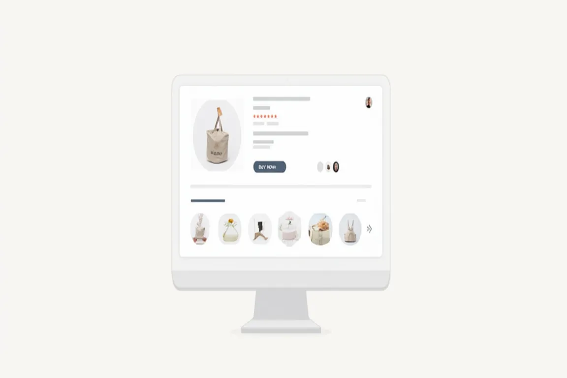
The ‘Above the Fold’ Trust Signal: Winning the 2-Second Cognitive Window
Most legacy brands still bury their valuable UGC at the very bottom of their product pages, acting as if the customer voice is an afterthought or a ‘nice-to-have’ supplementary feature. By the time a modern user actually scrolls down that far, they’ve usually already made up their mind to leave – or they’ve already moved on. You have a tiny, roughly two-second window to convince a new, skeptical visitor that they are in a safe, verified, and trusted environment. To win, you need to provide a high-power trust signal ‘above the fold’ (the part of the page visible immediately without any scrolling).
A simple 5-star rating icon located directly next to the product title or a small, tasteful ‘Trusted by 10,000+ real customers’ badge can be more than enough to keep someone engaged on the page for those critical extra seconds. I strongly recommend adding a ‘Jump to Reviews’ anchor link that shows the average rating and the total verified count. It signals to the visitor immediately that they aren’t the first brave person to consider this specific purchase. It provides the initial layer of psychological safety needed for them to actually dive deeper into your technical product details. This is a core part of maximizing ROI through repurposing UGC – using your community’s active voice at the exact millisecond it’s needed most for decision-making. Proof should be the first thing they see.
Shoppable UGC Galleries: Removing Friction from the Discovery Path
One of the biggest and most profitable trends in 2026 e-commerce design is the ‘Shoppable Community Gallery.’ Instead of just presenting a boring, vertical list of text-only reviews, you should feature a vibrant, interactive grid of real-life customer photos and videos. When a user clicks on an interesting photo, they shouldn’t just see a larger version; they should see the exact product(s) featured in the photo with a direct, friction-free link to buy it right there. It’s essentially an interactive, community-made lookbook.
This design pattern radically reduces the ‘path to purchase’ by showing the product in a real-world, lifestyle context and providing an immediate, tactical way to buy it without navigating away. It’s the digital equivalent of ‘window shopping’ in a high-end district. For more on the specific visual side of this strategy, take a look at my guide on the rise of video reviews in e-commerce. I recommend placing these shoppable galleries just below your high-level product description to provide a psychological ‘break’ between your corporate marketing claims and the community’s unvarnished reality. A shoppable gallery on a product page can significantly increase average order value (AOV) because it naturally shows how a product can be styled, paired, or used creatively with other items in your collection. It helps the customer cross-sell *themselves* by seeing how multiple products work in a real-life setting beyond the studio. People buy entire looks, not just individual items.
Filtering for Deep Relevance: The Custom Attribute Revolution
Not all customer reviews are created equal, and in 2026, we know that a blind wall of 500 reviews can actually be overwhelming and counterproductive for a busy shopper. You need to give your users the granular tools to find the specific information that is relevant to *them* and their unique situation. We’ve moved far beyond just sorting by ‘Latest’ or ‘Highest Rating.’ We now live in the era of ‘Custom Attributes.’
If you sell beauty or skincare products, for example, let the users filter reviews by ‘Skin Type,’ ‘Age Group,’ or specific ‘Skincare Concern.’ If you sell apparel, let them filter the results by ‘Height,’ ‘Weight,’ or ‘Usual Size.’ When a potential user finds a detailed review from someone who looks exactly like them, lives in a similar climate, or has the same lifestyle needs, the social proof becomes 10x more powerful. It’s no longer just a generic review; it’s a tailored case study for their specific life. This highly curated approach to social proof is a high-value skill that requires a deep, ongoing understanding of your customer’s deepest pain points. It’s about being a master ‘Curator’ of trust, not just a passive ‘Collector’ of data. Every relevant filter you add is another potential friction point you are removing from the final customer’s journey. Personalization is the highest form of service.
Social Proof Stacking: Leveraging the Power of Multiple Signals
In 2026, you shouldn’t just rely on one single type of social proof to do all the heavy lifting. The highest-converting product pages use a technique I call ‘Social Proof Stacking.’ This means intelligently layering and combining text reviews, customer photos, short-form videos, and even real-time behavioral data onto the same page. For example, imagine a page where you have a small, non-intrusive pop-up that says ‘Sarah from New York just purchased this 5 minutes ago’ appearing alongside a five-star verified review and a customer-uploaded unboxing video further down.
This multi-layered approach targets different types of buyer trust simultaneously. The ‘just purchased’ signal shows high current market demand; the text review shows historical satisfaction; the unboxing video shows the physical reality and quality of the product. Together, they create an undeniable, infectious atmosphere of popularity and reliability. It’s the digital equivalent of a restaurant that has a line out the door, a full dining room, and a massive ‘Best of the City’ award displayed in the front window. Combining these diverse signals is a key strategy I discuss in building a community of brand advocates – where individual, isolated trust signals merge into a permanent, community-wide endorsement. You are creating a field of social momentum.
The Immutable Value of the ‘Verified Purchase’ Badge in an AI World
In an age of increasingly convincing AI-generated content and sophisticated fake reviews, the ‘Verified Purchase’ badge is arguably your most important digital asset. It tells the hesitant shopper that this is a real, living person who actually reached into their own wallet and spent their hard-earned money on your specific product. This level of transparent, third-party verification builds a ‘Trust Moat’ around your brand that competitors simply can’t fake with a ChatGPT prompt or a farm of bots.
As the team at Shopify has noted in their recent global commerce research, products with prominent verified reviews have a 35-40% higher trust rating than those without. Do not ever be tempted to pad your numbers with fake or incentivized reviews that don’t disclose. One real, unpolished, slightly critical but verified review is worth more than a hundred generic fake ones. It’s the ‘Blemish’ that proves the overall beauty of the brand. For more on the foundational evolutionary reasons why this work so well, check out our post on the psychology of social proof in e-commerce. Authenticity is the only currency that isn’t inflating as we approach the late 2020s. If you lose your hard-earned reputation for authenticity to save a few bucks on marketing, no amount of future ad spend will ever truly bring it back. Trust is hard to build but very easy to break.
Mobile-First UGC Design: Optimization for the Thumb
Let’s face the reality: over 80% of your modern shoppers are browsing and buying on their phones while on the go. If your UGC gallery is a clunky, desktop-only grid that requires pinching and zooming, you’re failing your customers. Your UGC must be designed ‘Mobile-First’ from the ground up. This means large, easily tappable images, intuitive horizontal swiping carousels, and video players that load instantly and don’t cover the entire screen or stutter during the scroll.
I always recommend using a ‘Swipe-to-Browse’ horizontal carousel for reviews on mobile devices rather than a long, vertically exhausting list that keeps the user scrolling forever. It feels natural to the thumb and keeps the user’s focus on the product page rather than sending them off to a separate, slow-loading ‘reviews’ page, which can fatally break the momentum of the emotional sale. Site speed on mobile is also absolutely critical – your UGC widget scripts should be the very last thing to load via ‘lazy-loading’ to ensure your core product photos and the ‘Add to Cart’ button are always instant and responsive to the user’s first touch. This level of technical discipline is exactly what I focus on when building my freelance portfolio for high-end e-commerce clients who demand extreme performance as much as beautiful aesthetics. Speed is a feature, and trust is the goal.
Video UGC on the Page: The ‘Final Boss’ of Conversion and Returns
If a photo is worth a thousand words, an authentic customer video on a product page is worth a thousand professional photos. A quick, 15-second video of a customer showing exactly how the product works in their house or how a garment fits their body removes the final, highest layer of consumer doubt. It proves the actual scale, the true color accuracy under real light, and the daily utility in a way that static assets simply never can.
I recommend placing your video UGC either at the very end of your main image gallery or in a dedicated ‘Our Community in Action’ section further down the page. According to recent data from Loox, product pages that feature at least one video review see a 25% lower return rate on average because customers had a much more realistic, accurate expectation of what they were buying. It’s an essential, non-negotiable tool for providing the ‘Tactile Transparency’ required for high-ticket online items. You’re essentially using your happiest customers as your unofficial, global ‘sizing and quality control’ team. It’s a powerful, cost-effective application of the impact of customer photos and videos on conversion rates. Reality is your best salesperson.
The Advanced Product Page UGC Optimization Checklist for 2026
To ensure your brand’s product pages are fully optimized for maximum UGC impact and conversion in 2026, use this professional checklist:
1. Strategic Placement: Is there a clear trust signal (average stars and count) located above the fold near the title?
2. High-Impact Visuals: Does the main review section include a vibrant, high-res gallery of real customer photos and videos?
3. Path Shoppability: Can users click a specific UGC photo to see the product technical details and a quick-add button?
4. Rigorous Verification: Are all reviews clearly and prominently marked with ‘Verified Purchase’ badges?
5. Relevance Filtering: Can users instantly filter the review wall by attributes relevant to their specific needs (e.g., fit, skin type, use case)?
3. Mobile Native Design: Is the entire UGC experience smooth, horizontally-scrollable, and native-feeling for mobile thumb users?
4. Performance Speed: Does the UGC widget use advanced lazy-loading scripts to protect the core page load time and SEO score?
Building the Ultimate Conversion Stage
Your product page is the final ‘end zone’ of your entire marketing funnel. It’s the place where the hard decision to spend money is actually made. By strategically placing UGC where it’s most needed, using shoppable community galleries, providing smart custom filters, and prioritizing mobile-first performance, you can turn your product pages from static brochures into dynamic community hubs that celebrate your brand.
Stop talking and shouting *at* your customers and start letting them talk and share *to* each other in the most high-impact, high-stakes areas of your site. The trust will naturally build itself over time, and the conversions will follow as a byproduct of that authentic human connection. In the hyper-competitive market of 2026, the brands that win are those that provide the most radical transparency and the smoothest, most authentic shopping experience possible. For more on how to generate this high-quality content in the first place to populate your pages, check out my guide on incentivizing customer photos. Your product page is your brand’s ultimate stage – make sure your real customers are the absolute stars of the show. Trust is the final frontier.
Leave a Reply